Project Description

![]()
Ing Direct

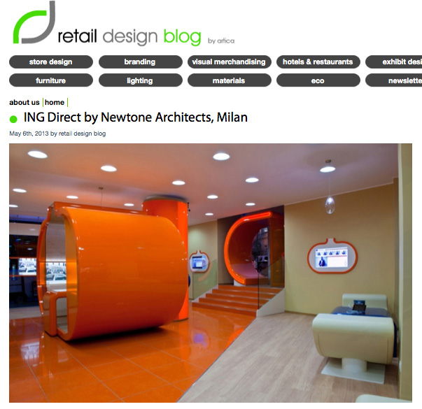
DESIGN IN A PUMPKIN
Tutto nasce da un ricordo di prima infanzia, lo stato d’animo percepito stando seduto nella cassa armonica di un contrabbasso, nella bottega di un amico liutaio.
Profumo di legno antico e cera d’api, protezione, calore e silenzio: armonia.
Ho pensato ad uno spazio che comunica la sensazione di una cassa armonica, in cui ci si sente protetti e rassicurati dalle complessità di ogni giorno.
Lo spazio Ing Direct riconduce alla naturalità, alla solarità dell’accoglienza, alla spontaneità d’uso, alla linearità e rotondità delle forme, alla totale integrazione della tecnologia amica. Ing direct riporta il cliente al centro dello spazio: un brand che si prende cura di te, comunica fiducia e sicurezza, con interazione, relazione e dialogo attivo.
Marco Michele Rossi
Intervista a Marco Michele Rossi, creative director di Newtone, Interior Design Magazine USA
The concept
Has this project allowed you to put into practise an already existing idea, theory or concept? Has it presented any new conceptual challenges?
The idea was latent in the needs of the customers, IngDirect was an online bank that intended on become visible and physically visitable, which you can walk in to, shake someone’s hand and smile while talking about your savings, and above all becoming a bank which would visually translate the IngDirect brand. The concepts we looked to convey were all contained in the values of the brand – low-cost/high-value, transparency, innovation, linearity of process, paperless, relatability, easily accessible services, radiance, welcomeness, putting the client at the centre of attention.

The client
Has daily life, specific requirements of planning, aesthetic preferences or anything else created an interesting opportunity from a creative point of view?
The client is a target that looks for linearity, trust and reassurance, he is a consumer gifted with ‘mental ecology’ therefore looks for a brand that offers services and products that are easy to understand with no hidden tricks. The project is shaped around the client in order to create a ‘cocooning embrace’, in which they feel welcomed, protected and psychologically orientated to understand and communicate with ease and trust the interlocutor. The international financial system had brought about a skeptical attitude from the client in regards to the brand promises in this field, for this reason we have looked to find an atmosfere in which there is a spontaneity of approach and a feeling of ease, even at an acoustic, olfactory, lighting and chromatic level, which are very important factors, often neglected in projects of this kind.
The design
Has there been any particular obstacle or challenge?
The retail space is the most powerful tool of communication which the brand arranges in order to put across its values. The focus of the design was coming up with a shape that would become an ‘icon’ of the brand, the pumpkin which has been the avatar of Ing Direct for 10 years was a great place to start, the first pencil line that was pulled across the paper came from that shape. the idea was that nature would be at the centre of the space which would communicate fondness, reassurance and involvement. Newtone projects have a precise characteristic which is our primary objective. When you look at a photograph of our project, you can try to remove the institutional colour of the brand (orange), then the logo that appears in the interior, but the project will still remain faithful to IngDirect. In other words, the values have been transfered form the DNA of the brand into the space. That bank can only be IngDirect and no other. The project is unique to the brand because it corresponds to it exactly, it’s like a tailor-made suit, like you have extracted the codes and forms present in its DNA and made them tangible.

The process
What strategic mission, practical solution or innovative discovery has characterized the project?
We found a good practical solution to attracting customers found in the layout which is strongly innovative because it encourages the public to spontaneously take part in the space, it’s inviting, there are no barriers, it’s a curve of wood that invites you to , it is a free-flow space in which you can work alone or with assistance. Alternatively you can enter the pumpkin which represents the avatar of the brand in which there is more privacy and you feel at the centre of attention of the bank. The space was conceived to communicate with the client in a friendly way across educational aspects, and openness to the public, welcoming anyone who intends to enter the bank or even just visit it as a store. A new business model interpreted with a layout designed in a way that creates innovation and wonder, attractiveness and above all generates a complete brand experience.
Materials and technology
The use of innovative materials and technology, does the rediscovery of the virtues of classic materials and technology play a fundamental role? Wood is a material par excellence that communicates warmth and serenity, maximizing its use in the context of a banking store creates a domestic familiarity with the interior?
Enter the bank and take a seat in your armchair” is written on ing direct’s website, in the sense that you can complete all your bank operations online form the comfort of your home. I decided to overturn this concept so that when you really enter one of the bank branches you feel at home as much as possible, with a serene and welcoming feeling, working from a comfortable seat. There is a natural-tech fusion in which hi-tech technology is integrated with hi-touch. The crystal hanging lamps were designed by Marco Michele Rossi, and produced by Artemide, and represent pumpkin seeds that become drops of light, the armchairs integrated into the curves of the wood grow freestanding from the rounded walls.

Sustainability
Does sustainability or another type of ‘green approach’ have a strong impact on the project?
We used recyclable materials, the wood is ecologically laminated, the varnishes are water-based as opposed to nitrate-based, we use low-consumption lighting or LED, the armchair covers are made from eco-friendly leather, the flooring is covered in recycled glass chips impasted by marble powder.
Collaboration
Thanks to a new mode of collaboration has the project obtained a better result?
Thanks to the synergy between Newtone and New Architects, and the great competence of general contractors that have produced furniture of the highest quality typical of That made in italy. The experience of new architects (our partner in project management and executive planning) in the rollout of retail chains, and the agility of the contractors, made it possible for the bank to open its first shop only four months after the approval of the concept design: a record time, considering each element of the furnishing is original and unique, made to measure solely for the italian branches of IngDirect. We can affirm that italian genius and laboriousness was the key determiner in proceeding with plans to open a Dutch bank.


The take away
Thanks to this project if there anything you have learned that you can carry into the future?
We have learned that it is fundemental to offer a complete and holistic service with which the client can be satisfied in all the steps necessary in completing a task: from the analysis of marketing strategy of the brand, to the design concept, to the executive project, project management and the realisation with key in hand.
MEDIA
Ing Direct Branch by Newtone: the video
TheMarker Magazine
OfficeLayout n. 150
Retail Design Blog
Interior Design Magazine
Ing Direct won the tenth place out of a hundred selections of Interior Design Magazine.