Project Description

![]()
Herschel
Worldwide retail format
2016

Herschel gallery
To reflect a brand’s values and contents in a space, its unexpressed characteristics must be expanded and its distinctive language codes, representing its style, should be pinpointed, in order to transfer them to an environment that will convey them.
Herschel’s essentiality is clear in its products, visuals, details, materials, shapes and volumes, as well as in its primary and neutral color scheme.
The partial re-use of some furniture pieces already owned by Herschel was mandatory for this project. These were small tables and panels with poly-material squares fitted with hooks and shelves, coming mainly from “corners” and standard stores.
This furniture was integrated in a more elaborate and innovative concept which generates a sophisticated display system in harmony with the design of the existing elements.

A flagship store requires a larger expressive dimension that implies a wider vision of the product and of the modes through which it appears in a unique and characterizing setting.
The project’s main concept relies on a minimalistic and no-design spirit, by using a rhythmic display along the side walls that allows for a more dramatic segmentation of the merchandising and that accommodates the existing furniture in a coherent dialogue based on materials and design.
I tried to sculpt a neutral volume, without designing furniture, in order to maximize the product’s visibility.
The characteristics of the Corso di Porta Ticinese space in Milan can make it a perfect exhibition gallery: 130 square meters incorporated into a long and narrow layout that turns left to then reveal, at the very end, a wall with a stage to welcome the Herschel community to an events and reading area.
The spatial envelope is entirely covered in a special resin with a cement-like result, giving out a satin, homogeneous and mono-material chromatic effect on walls and floors. It is all done in mother-of-pearl grey, the non-color par excellence, which allows the various colored product to be displayed without any distraction and spotlights them.


On the existing walls, I alternated recesses, whose backdrops are lit by a hidden led source emphasizing the surfaces’ tactile aspect, with large theatrical wooden frames, both encasing a new exhibition system made of aggregated parallepipeds. These iron wireframe stands can hold and display the products in a discreet and random fashion.
Niches and frames within an extremely rational interior design, built with authentic and achromatic materials: a palette featuring concrete, wood and iron, and illuminated in a theatrical manner.
The lighting relies on simple elements, casting the stands’ shadows on the walls and creating decorative patterns.
A system that produces geometric shapes springing from lines and light.
Within these display structures, the product acquires a more distinctive identity, as if it were a painting in an exhibition. Each recess or frame draws attention to the uniqueness of a style and its variations in the matching of product and collection.
Herschel is adventure, travel, style and freedom.
The wireframe system becomes a versatile tool, ready to tell a story by depicting it in each individual display unit, whose theme is further revealed by a visual communication element, characterizing a diversified “total look” in every exposition.

MEDIA
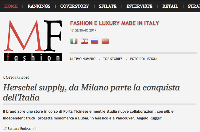
mffashion.com
Herschel supply, da Milano parte la conquista dell’Italia
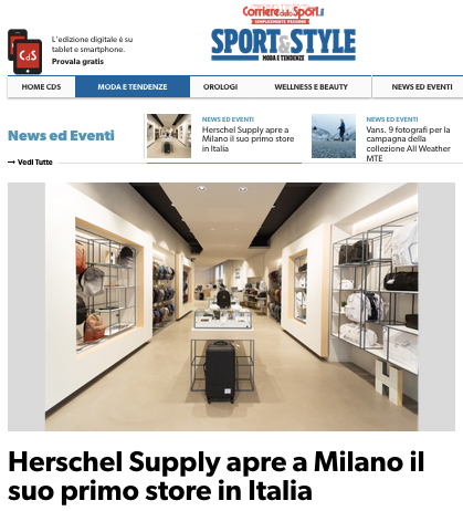
corrieredellosport.it
Herschel Supply apre a Milano il suo primo store in Italia
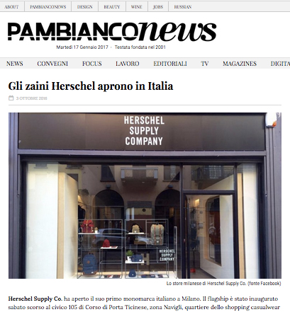
pambianconews.com
Gli zaini Herschel aprono in Italia
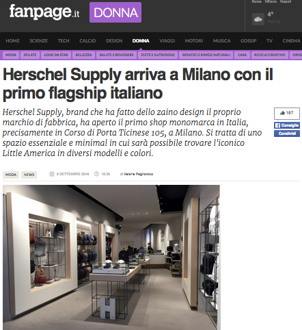
donna.fanpage.it
Herschel Supply arriva a Milano con il primo flagship italiano